
Becoming the ideal healthcare provider
Why has it to be such a thorough change covering the entire organization?
A simple made-up case gives the answer. The case illustrates a healthcare organization delivering 550.000 services a year. Each of the services rendered is quality scored on a scale from one to fourteen, where one is a very poor quality and fourteen is the highest quality any medical system can deliver.
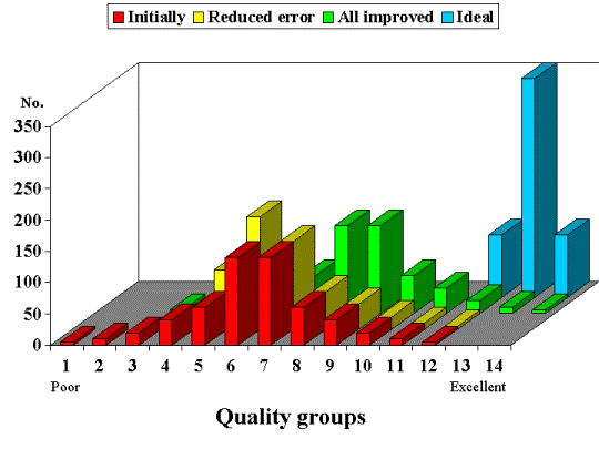
Quality performance can be visualized as a normal distribution. Thus the curve is symmetrical and bell-shaped 2 (see Figure ,” Quality groups ”). The red bars – the ‘Initial’ curve - represent the quality delivered by the organization today.
From an individual patient's point of view it is most important that the organization improve the quality in exactly the area where the individual patient is dependent of service. However the patient’s influence to get the organization to make improvements is very limited. But sometimes the media bring horror stories telling an individual patient’s bad outcome after he’s or she’s encounter with the healthcare system. That can trigger the politicians to demand action. Normally the administration of the healthcare provider quickly identifies the poor performing area – in this case the lower quality levels. To counter the demands from the politicians it is therefore decided to make an effort to reduce the errors. As a result the organization succeeds in improving the quality of those services that previously were rated in category one and two (15.000 services) so that these now are raised to quality group five. Further more all services rated as category three and four (60.000) are improved on average two levels. In other words all 75.000 services, which were formerly rated one to four, is now lifted up to quality level five and six. The yellow bars – the ‘Reduced error’ curve - show the new distribution. This change as it is seen on the yellow graph actually does not move the “average” service level significantly. Statistically the curved is described as either positively skewed or right skewed 2 .
If the focus is only on the under-performer the average does not move significantly towards higher quality but the bell will be narrower with higher peaks. Of cause the higher peaks represent a more equal access to the “average” level of quality than before. This is one of the mechanisms why many of the extra appropriations to healthcare seemingly do not have any effect; it just extinguishes the fire so that there is no smoke for the politicians to see.
From a public health perspective it is important that all organizations develop higher quality so that the “average” quality of care rises 1 . Thus it is especially important that the middle range performer increases quality. Never the less it is still important that the top-performer continues to be nourished so that their superiority can maintain their status as locomotives. The green bars – ‘All improved’ curve - show the situation where all institutions in the organization have worked to elevate their own “average” level two levels upward. Of cause now the “total average” quality has improved for all services and the two “error” levels namely quality levels one and two are eliminated.
The ideal situation represented by the blue graph – the ‘Ideal’ curve - is the situation where all the institutions learn from the top-performers’ experience resulting in all care reaching quality level 12 to 14. In this situation the healthcare organization delivers high quality services with equal access – the ideal healthcare provider.
Becoming the ideal health care provider - using the EQK-pyramid to get there
Scally G,.Donaldson LJ. The NHS's 50 anniversary. Clinical governance and the drive for quality improvement in the new NHS in England. BMJ 1998;317:61-5.
Kirkwood BR. Essentials of medical statistics. Oxford: Blackwell Scientific Publications, 1990.
@ct Consult
Mail to: admin@act-consult.com